Harry’s Design Change
I just noticed Harry’s (harrys.com) did a design change. I’m not a fan.
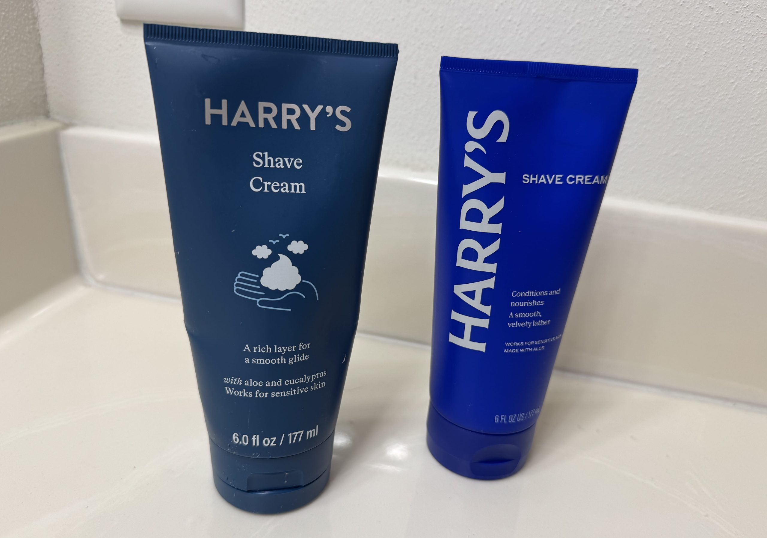
They went from what was a more luxury color, in my opinion, to more of an elementary / juvenile type of color – a more basic blue. Like, why? This didn’t elevate the brand at all – anyone can see that.
They also went to a serif font, which makes it look older, in my opinion. I preferred the sans-serif font. You don’t see many brands going from sans-serif to serif. Very strange.
The old container looks bigger, too, right?

The old bottle had a graphic, which is nice.
The old bottle had the name across the top instead of sideways. What? Do you expect me to turn my head?
I think this was a blunder. That’s my opinion. What do you think?
📄 Download a PDF of This Article