Apple iOS 26 Flat Pill Style Toggle CSS
 Reading Time: 2 minutes
 TL;DR Summary: Design a reusable iOS 26 flat pill toggle using CSS variables for easy customization. The toggle includes a cross-fading text label and is designed to mimic the Apple iOS switch style. Simply drop the provided CSS into your stylesheet and adjust the variables to suit your UI needs. Explore the demo to see it in action. To delve into the details and implement this sleek toggle design, read the full article here.
Drop‑in CSS + minimal HTML. No JS required.
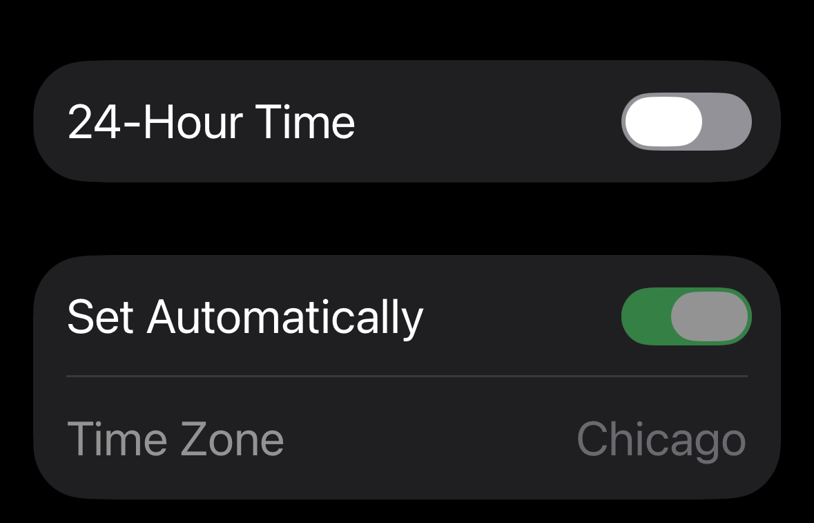
I couldn’t find a clean “new Apple toggle” CSS anywhere, so I designed a longer, flatter switch. It’s reusable—drop this in your CSS and markup. It’s not perfect, I’ll admit that, but it’s pretty close.
This is a longer, flatter take on the classic iOS switch—what I’m calling the iOS 26 flat pill. It uses CSS variables so you can quickly tweak size, colors, and handle ratio. The adjacent text label cross‑fades between two states using only CSS.
Demo
Here’s where you can see a demo of how the code I have here works.
The CSS
Paste this into your stylesheet. Tweak the variables at the top to fit your UI.
/* Apple iOS 26 Flat Pill Toggle — TonyHerman.com */
:root{
  /* Geometry */
  --switch-w: 64px;     /* track width  */
  --switch-h: 25px;     /* track height */
  --pad-x: 2px;         /* left/right inset for handle */
  --pad-y: 4px;         /* top/bottom inset for handle */
  --handle-w: 35px;     /* handle width (≈60–65% of track) */
  --handle-h: 17px;     /* should equal switch-h - 2*pad-y */
  --tx: calc(var(--switch-w) - var(--handle-w) - (var(--pad-x) * 2)); /* travel */

  /* Colors */
  --on:  #34C759;       /* iOS green */
  --off: #929197;       /* Medium gray (off state) */
  --hair:#929197;       /* hairline on track */

  /* Motion */
  --ease: cubic-bezier(.2,.6,.2,1);
  --dur:  .16s;
}

.switch{ display:inline-flex; align-items:center; }
.switch-input{ position:absolute; opacity:0; width:0; height:0; }

.switch-label{
  position:relative;
  display:inline-block;
  width:var(--switch-w);
  height:var(--switch-h);
  cursor:pointer;
  vertical-align:middle;
}

/* Track */
.switch-label .switch-track{
  position:absolute;
  inset:0;
  border-radius:999px;
  background:var(--off);
  box-shadow: inset 0 0 0 1px var(--hair);
  transition: background-color var(--dur) var(--ease), box-shadow var(--dur) var(--ease);
}

/* Handle */
.switch-label .switch-handle{
  position:absolute;
  left:var(--pad-x);
  top:var(--pad-y);
  width:var(--handle-w);
  height:var(--handle-h);
  border-radius:999px;
  background:#fff;
  transition: transform var(--dur) var(--ease);
}

/* ON state */
.switch-input:checked + .switch-label .switch-track{
  background:var(--on);
  box-shadow: inset 0 0 0 1px color-mix(in srgb, var(--on) 60%, transparent);
}
.switch-input:checked + .switch-label .switch-handle{
  transform: translateX(var(--tx));
}

/* Keyboard focus */
.switch-input:focus-visible + .switch-label .switch-track{
  outline:2px solid color-mix(in srgb, var(--on) 35%, transparent);
  outline-offset:2px;
}

/* High-contrast/forced colors */
@media (forced-colors: active){
  .switch-label .switch-track{ forced-color-adjust:auto; }
}
The HTML:
Use a native checkbox with role="switch" so you get keyboard/touch and accessibility for free.
<div class="switch">
  <input type="checkbox" id="iosSwitch" class="switch-input" role="switch" aria-label="Toggle">
  <label class="switch-label" for="iosSwitch">
    <span class="switch-track"></span>
    <span class="switch-handle"></span>
  </label>
</div>
Quick tweaks
- Make it longer/flatter: set
--switch-w: 72px;(try 72–80px). Keep--handle-wabout 60–65% of track width. - Tighten the motion: set
--dur: .12s;or change--ease. - Color theme: change
--on,--off, and--hairto match your palette.
Example (wider):
:root{ --switch-w: 72px; --handle-w: 42px; }Accessibility notes
- The native checkbox +
role="switch"exposes the right semantics to AT. - The handle/thumb is purely visual; state lives on the input.
:focus-visibleadds a clear but subtle outline for keyboard users.
License
MIT. Attribution appreciated: “iOS 26 Flat Pill Toggle by Tony Herman.”